
Stern Career Services
How might we…
Student UX Researcher
July-August 2022
+ UX Research
+ User Persona
+ Competitive Analysis
+ Information Architecture
+ Content Design
NYU Stern School of Business is among the top 10 MBA programs in the US. The Office of Career Development (OCD) plays a vital role in the successful recruitment of students into top firms by providing on-campus recruitment opportunities, one-on-one advising, workshops, and more career services.
However, OCD staff continues to encounter current students, incoming applicants, and employers who have difficulty accessing information on the office’s diverse services. They are unsure why, as they believe that all necessary information is available online.
To discover why frictions occur, I was tasked with the role of a UX researcher. In 2 weeks, I empathized with users and mapped out their journeys.
📌 Project Summary
Background
NYU’s mobile portal for academic and administrative resources. However, the app is largely ignored by the student body.
Goal
Analyze the user journey to accessing information on OCD.
Discover frictions and provide solutions.
Challenges
x
My Role
User research, user persona creation, competitive analysis, information architecture
Impact
x
🔑 My Step-by-Step Approach
Defining the Problem
OCD cou
xx
x
x
x
x
🧠 Identifying the problem: figuring out how users interact with the main Stern site
For user research, I interviewed 5 students who have used NYU Mobile and had them map out their typical process to me. The main insights I found were:
All students primarily use NYU Mobile to retrieve their Daily Screener, a pass presented upon entering any NYU building.
4/5 students said they are confused as to what exactly are NYU Mobile’s primary functions. Is it for academics? Building access? Covid updates?
3/5 students said they don’t use NYU Mobile because they rarely to never view academic resources on mobile.
2/5 students noted that they have iPads, and so they use NYU Mobile to access their academic resources on iPad.
Current user journey
I mapped out the user journeys to arriving at OCD’s page from the Stern website.
Key Problem Areas
From my research, I identified three challenges users faced in attempting to access information on OCD:
(1) I identified 3 types of users attempting to access information on OCD. These 3 are: incoming students, current students, and employers. The diverse audience makes navigation complex.
(2) The current user journey contains too many touchpoints to arrive at OCD’s page.
(3) OCD’s page is more of a contact directory than it is an informational tool.
🌟 Opportunities
How might we segment information needed by the 3 types of users (incoming student, current student, employer)?
How might we arrive at the OCD page intuitively and efficiently?
How might we clarify the user journey by lessening touchpoints?
I set constraints for myself to stay true to the app and promote consistency. First, to work with the features that are already present on NYU Mobile. Second, to not take out any feature.
Given the time I set for myself, I decided to only reimagine the Student viewer mode of the app.
Empathizing with Casper, an incoming MBA applicant📁
I created a user persona to map out a typical journey, empathize with the user’s needs, and uncover challenges they might face.
Ideation drafts…
Seeing how Stern matches up to its competitors 📁
I conducted competitive analysis to see how fellow schools structure their websites and identify what information is prioritized.
Interviewing Stern students and staff 📁
I conducted competitive analysis to see how fellow schools structure their websites and identify what information is prioritized.
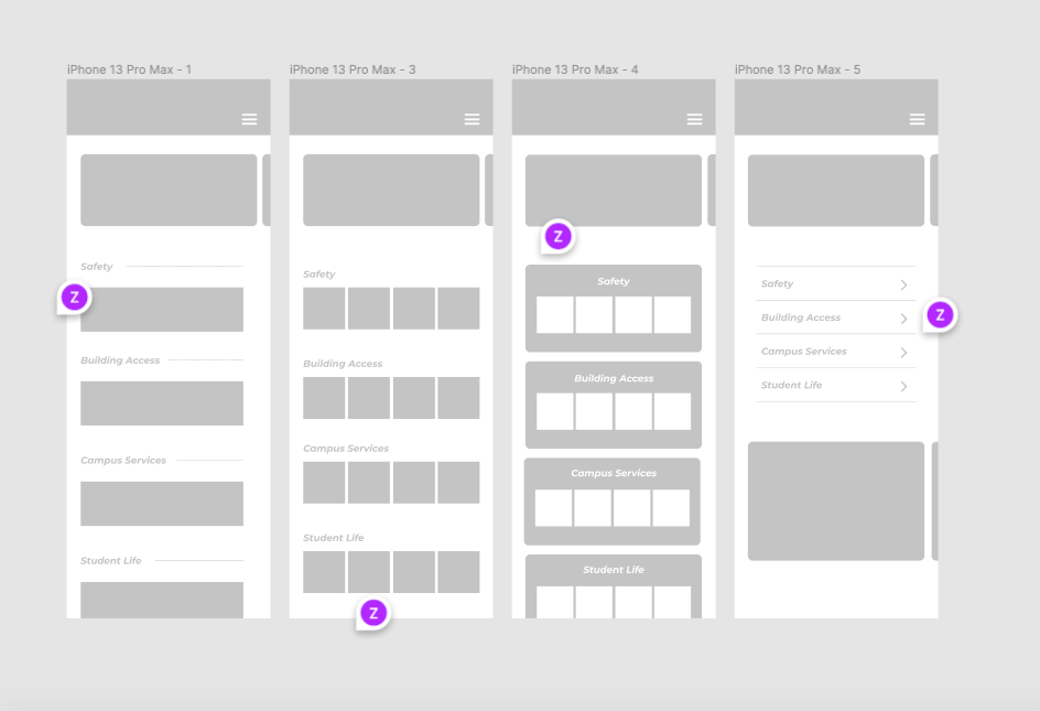
✏️ Sketches and Wireframes
I explored different interfaces through hand sketches and low fidelity wireframes. I incorporated my categories to understand how users would best engage with my new content structure.

💡 Design Solutions
Simplifying the user journey by lessening touchpoints
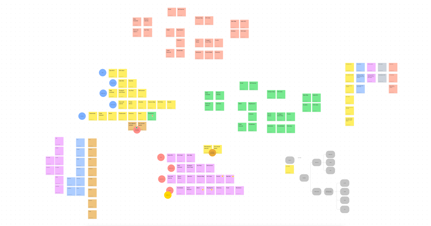
I decided that the most important step would be to merge information to one comprehensive page and create redirection only when necessary. Instead of having to navigate separate links/pages, I collated all information related to OCD and career services.
I came up with a proposed information architecture to restructure the site flow.
After meeting with OCD coaches, I was corrected that not all programs are under OCD nor. This further complicated the flow of information. I created more maps and charts to organize how to segment programs and services:
Categorizing information
Diverse user groups look for different types of information. It became important to segment what information is available to each user group.
Improving visual stimuli
To create pages that are more pleasing to the eye, I looked to my competitive analysis to see how other schools create visually stimulating yet informational pages.
Final Product
💭 Reflection
This was my first self-initiated UX redesign project and the project enabled me to practice human-centered design. Speaking to other students and immersing myself in their tasks allowed me to consider how users actually interact with NYU Mobile and how the app’s logical flaws could be cleaned up for more joyful experiences.
Moving Forward
Given more time, I would like to explore beyond the constraints I set for myself. I would like to explore the faculty/staff and guest viewer modes to gain a holistic understanding of the NYU Mobile experience.