
NYU Mobile Redesign 🗽
How might content-driven design encourage students to discover and access university resources?
My Role
Personal Project
Tools
UX Design & Research
Figma
Duration
January 2021

Project Summary
Background
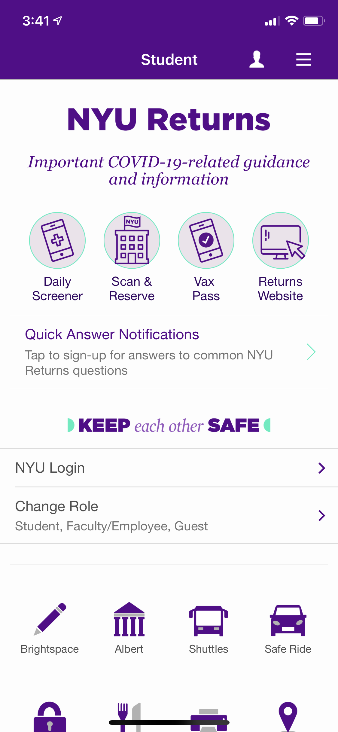
NYU’s mobile portal for academic and administrative resources.
However, the app is largely ignored by the NYU community.
Goal
Reimagine NYU Mobile’s student homepage and navigation menus
Challenges
Lead a content-driven redesign that improves findability and encourages exploration
Role
Product Designer
UX Researcher
Impact 🏆
A content-driven approach that improves findability and encourages exploration. Design that prioritizes what is most essential to the primary user, NYU students. KPIs of increased access to and awareness of university resources met.
Overview
NYU Mobile is the central mobile portal for New York University students, faculty, staff, and visitors. It is a one-stop hub for both academic and administrative resources.
However, I noticed that many students do not use NYU Mobile or are unaware of the resources available on it. I wanted to figure out why this is, as it prevents students from having quick and easy access to daily resources.
With a desire to challenge myself, I decided to tackle this problem to practice my skills in UX, information architecture, and content design. In 3 weeks, I aimed to better understand how students interact with NYU Mobile and ultimately made changes by reducing excessive effort and organizing what was essential to users.
Summary of my Approach
➊ Research
Conducted user interviews, task analysis, and content audit
➋ Identify pain points
Translated pain points revealed in research findings into design opportunities
➌ Explore information architecture
Created comprehensive sitemap + ideated new information architecture to clarify task flows
➍ Wireframe & Prototype
Explored designs and restructured content to clarify task flows but still maintain NYU visual identity
➎ User Testing
Measuring success of final prototype, determining if KPIs were met
User Research
🧠 Learning how NYU students engage with NYU Mobile
I interviewed 5 students who have used NYU Mobile and had them map out their typical process to me. The main insights I found were:
All students use NYU Mobile daily to retrieve Daily Screener, a Covid safety pass required to enter NYU buildings.
4/5 students said they are unsure of what resources are available on NYU Mobile.
4/5 used the word “overwhelming” and 3/5 used “time consuming” to describe navigating NYU Mobile.
From my interviews, I synthesized 3 key problem areas:
Pain Point #1
Information overload
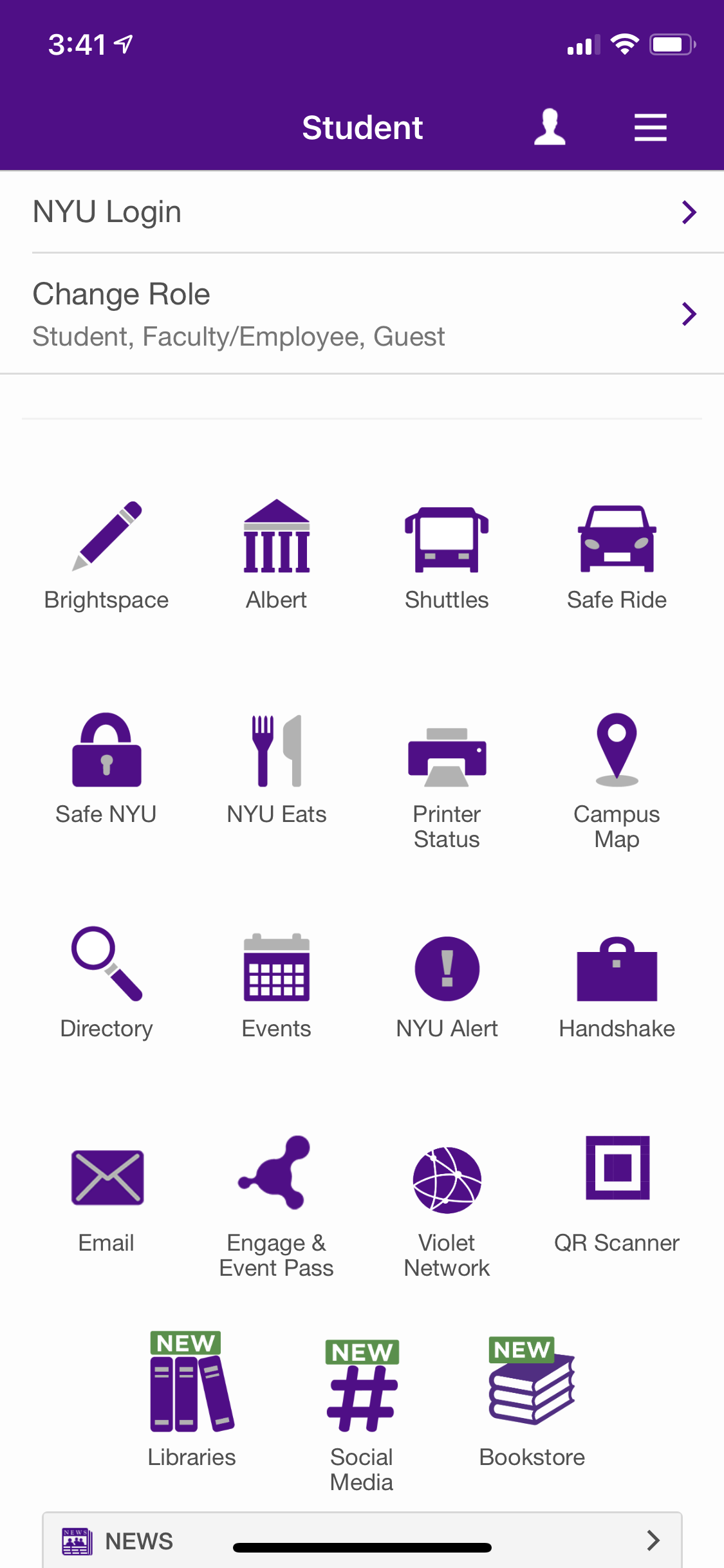
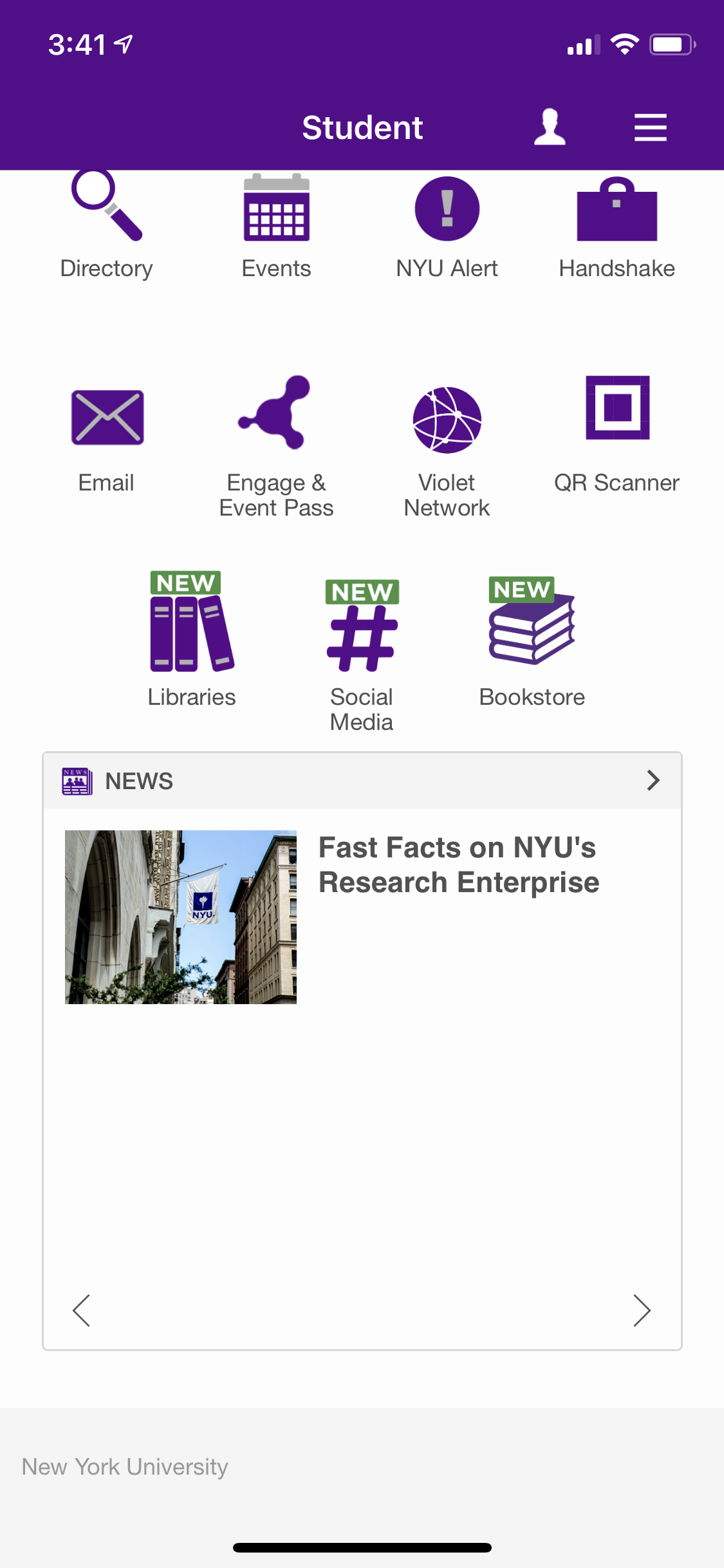
The current design lays out all features without organization scheme.
This takes up excessive effort and time for a user to look for the feature they need, causing frustration.
Pain Point #2
Two Menus
When tasked to view their account details, users interacted with the hamburger menu.
However, the hamburger menu only contains content already laid out on the homepage.
Account details are found in a separate profile menu, which all users found counterintuitive.

Pain Point #3
Inconsistent copy
Repetitive tasks using inconsistent language leaves users confused with how exactly to perform a task.


“Change Role” and “Tap to switch persona” both perform the same task, to switch viewer mode.


“Edit favorites” and “Customize my navigation” both perform the same task, to bookmark features.
Translating pain points into design opportunities
🤔
How can features be organized to increase confidence in navigation?
🤔
How might we create intuitive navigation?
🤔
How might we clarify task flows?
I set constraints for myself to stay true to the app and promote consistency. First, to work with the features that are already present on NYU Mobile. Second, to not take out any feature.
Given the time I set for myself, I decided to only reimagine the Student viewer mode of the app.
Ideation
Mapping out NYU Mobile’s information architecture 📁
I explored NYU Mobile myself and audited each of its features, breaking down its existing content structure and comparing notes from my interviews. By empathizing with student users, I determined how NYU Mobile’s information architecture could better meet user needs.
I considered how restructuring content could promote ease of navigation and encourage exploration.
Time is precious—especially for busy students!
To help students find valuable resources with the least amount of effort, I decided that a content restructuring was necessary.
I would do this by integrating categories that group like-features to improve homepage organization.
I ideated potential categories by turning to insights gathered from user interviews + my own content audit of NYU Mobile’s content structure.
Figuring out an intuitive organization scheme involved a lot of brainstorming trial and error! This is what that looked like:
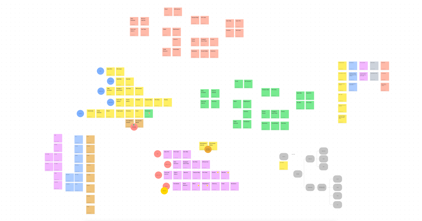
.
While ideating, I realized that simplicity was still key. I couldn’t integrate too many or too complex organization schemes as this would only add to feelings of information overload.
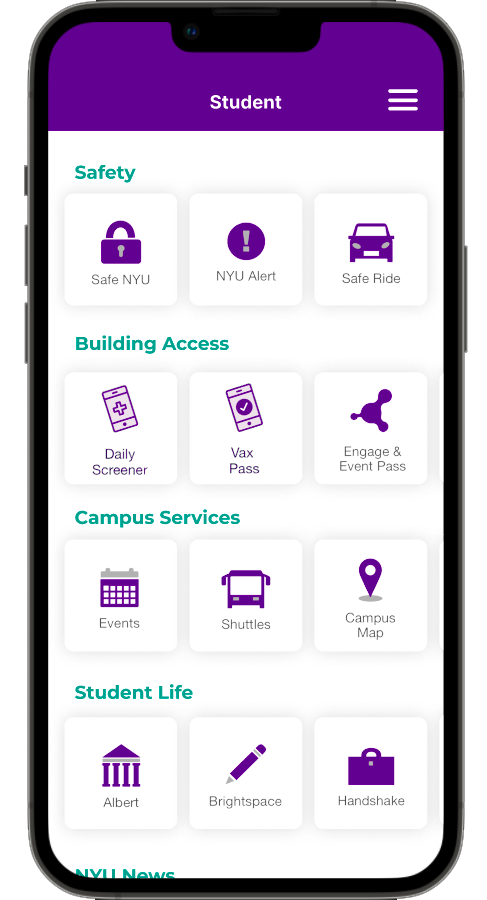
After multiple tests, I arrived at the following categories to integrate onto the homepage: safety, building access, campus services, student life.
✏️ Sketches and Wireframes
I explored different interfaces through hand sketches and low fidelity wireframes. I incorporated my categories to understand how users would best engage with my new content structure.

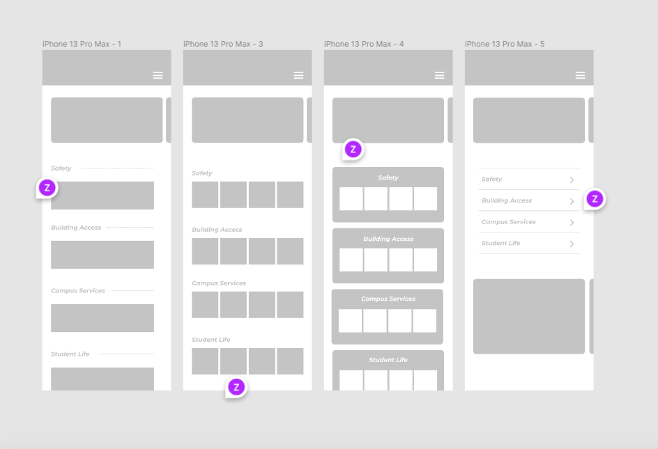
After user testing lo-fi prototypes, I arrived at 3 design solutions:
Design Solution #1
💡 Integrating categories
By grouping like-features, I was able to organize content to improve findability.
I defined content hierarchies by separating temporary features (like news and Covid policy updates) from permanent features.
Design Solution #2
💡 Clarifying navigation
I eliminated the need to navigate between two different menus by integrating their functions together.
To clarify task flows, I removed repetitive features both on the homepage and on the menu.
Here, I practiced UX content writing by addressing the pain point of inconsistent language. I approached writing microcopy with direct language and focus on function in order to avoid ambiguity.

I identified how this microcopy made content hierarchies unclear.
I proposed rewriting this to “Edit favorites” + minimizing its presence but locating it intuitively.

Design Solution #3
💡 Updating UI for clearer distinctions
I opted for a carousel swipe in order to avoid the feeling of information overload.
I used rounded shapes to (1) modernize overall feel, and (2) distinguish features since the illustrated icons vary in size and detail.

User Testing
My final prototype revealed a more joyful NYU Mobile experience!
🎉
Successful task accomplishment
5/5 users performed tasks without mistake or getting lost
🎉
Increased awareness of features
4/5 users identified features they previously didn’t know existed on NYU Mobile
🎉
Confidence in ability to navigate
5/5 users used “clear” to describe their experience navigating the final prototype
🎉
Encouraged to explore
4/5 users indicated that they were eager to explore resources through the final prototype
Final Product


Reflection
This was my first self-initiated UX redesign project and it enabled me to practice human-centered design. Speaking to other students and immersing myself in their tasks allowed me to consider how users actually interact with NYU Mobile and how the app’s navigation logic could be cleaned up for more joyful experiences.
Moving forward, I want to design products to meet people’s needs 💭
My biggest learning is the value of user input. Interviews informed me of perspectives I did not consider on my own and gave me insight as to how different users interact with my design decisions. Additionally, constant user testing allowed me to reiterate and improve my work.
Given more time, I would like to go beyond the constraints I set for myself and explore the faculty and guest viewer modes of NYU Mobile to gain a holistic understanding of the experience.