
Clinique Hero 💄
Improving an educational tool that incentivizes employee training while driving positive business impact
My Role
Internship, Estee Lauder Companies Philippines
Tools
UX Design & Research
Figma
Duration
Sept. 2019 - 1 week
Jan. 2020 - Presentation

Background
CliniquePlay Hero Edition (aka, Clinique Hero)
An existing internal educational tool for Clinique employees to continue training. Users play games to designed to develop retail skills and product expertise. However, Clinique Sales & Education noticed that employees rarely engage with Clinique Hero, and they aren’t sure why.
The Ask
How can Clinique employees be encouraged to engage with Clinique Hero?
Deliverable
Homepage redesign
Proposal to integrate onboarding and rewards page
Overview
As a summer intern at Estee Lauder Companies (ELC), I participated in a 1 week challenge to evaluate Clinique Hero, an existing internal tool for Clinique sellers to develop product proficiency and expertise.
I took the challenge further than a simple design analysis by initiating user research and setting success metrics. Having synthesized my research and analysis in < 2 days, I turned this into a redesign sprint with prototyped design solutions that emphasizes how good user experiences drive positive business impact.
I later presented my findings to Clinique Sales & Education. Upon completion of my internship, I was invited to continue with ELC as a freelance designer.

Discovery
First, understanding the Clinique company culture
I set out to learn why Clinique wants its employees to engage with Clinique Hero in the first place. What does Clinique get out of it?
To put myself in the perspective of the company, I sought to figure out what Clinique’s expectations are from its employees. I spoke to 10 employees with research goals in mind:
What are Clinique’s values?
What are the duties of Clinique employees, in-store and in-office?
What skills does Clinique want to hone in employees?
Key Takeaways
Clinique has an expansive product catalogue.
This ranges from skincare to make up to perfume. All employees (in-store and in-office) are expected to be knowledgable.
The official title for in-store employees is “consultants”
This indicates a high respect for employee professionalism and expertise.
Even in-office staff are expected to showcase high levels of product proficiency
Staff may not be client-facing nor directly selling products themselves, but are still expected to show an expert knowledge on the Clinique product catalogue.
I synthesized this about Clinique’s company culture:
Clinique expects employees to display product proficiency.
This helped me make sense of Clinique Hero, where users play games designed to test product knowledge and teach skills. These skills include: memorizing ingredients, matching make-up shades to skintones, understanding specific skincare needs.
…but what do employees get out of this continued training?
Doing my own audit of Clinique Hero, I realize that redeeming rewards through a gamified points system is an incentive to play.

Key Finding — Clinique seeks to train its employees, and employees seek incentive for their training.
Because when employees continue their training, they develop product proficiency
… which drives positive business impact for the company (business value)
… that they get rewarded for (user value)
Next, I spoke to employees to learn about how they currently engage with Clinique Hero.
I spoke to 10 consultants and staff to learn about their user experience. I went into my conversations hoping to learn about how they got started with Clinique Hero and what their experiences are with redeeming rewards. From these interviews, I found:

All employees have been onboarded onto Clinique Hero as part of their mandatory in-person training
8/10 interviewees have used Clinique Hero < 6 times
Everyone I spoke to was aware of the rewards incentive
Yet interestingly, no one has availed of rewards. When asked why, they said that they simply don’t know how the redemption process works—nor how to find more information.
Pain Points
Aha! This made me immediately recognize 3 problem spaces:
😥
Onboarding is conducted IRL
This adds unnecessary training time and work for both staff and consultants
😥
Rewards are not shown
Users don’t know how to find what rewards are up for grabs
😥
How to redeem rewards is hidden in the Terms & Conditions
Details are not disclosed upfront, leaving users confused
Opportunities
Translating pain points into design opportunities
🤔
How might we introduce users to the value of Clinique Hero?
🤔
How might users be reminded of the value of Clinique Hero?
🤔
How might we remove frictions on the Clinique Hero experience?
#1 — How might we introduce users to the value of Clinique Hero?
Design Solution #1
Off the bat, it doesn’t make sense that the Clinique Hero doesn’t guide first-time users through the experience. Think of this as going to a beginner pottery lesson and realizing there’s no instructor—it’s just you and a clay wheel!
Because of this, I sought to integrate an onboarding experience that introduces the user to the experience.
According to my own research, an onboarding even increases likelihood of retention and usage moving forward.
There are different types of onboarding styles and I tested a few out with lo-fi wireframes:
Product tour — I decided against this style because Clinique Hero doesn’t contain complex workflows. Users really only need to navigate a handful of functions.
Tool tips — I decided against this style because Clinique Hero’s tools are straightforward.
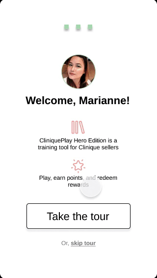
After multiple tests, my final decision was to employ welcome messages and progress bars as the experience is made up of simple functions that can be quickly walked through:
My Experience


Navigating how to capture the distinctly Clinique look.
Before launching into hi-fi wireframes, I researched on visual elements of the Clinique brand and synthesized these: rigid corners, clean lines, flat, black and white, limited pops of color (pink and green).
I wanted to design an experience that is warm and inviting but still distinctly Clinique. I collaborated closely with Sales and Education team to develop my hi-fi wireframes. I learned how compromises can be made to meet good UI principles and a brand’s identity.
Version 1
Warm and friendly but doesn’t align with any Clinique visual elements.
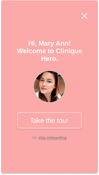
Final Version
Adheres to Clinique visual elements with minor compromises for good UI principles.
#2 — How might users be reminded of the value of Clinique Hero?
Design Solution #2
The whole incentive for users to engage with the experience is the gamified rewards system. Yet the rewards are not emphasized, nor is the redemption process disclosed upfront.
I sought to create obvious value for the user. I did this by…
Current Experience

My Experience

Displaying rewards front and center of the homepage
Visually obvious for users to view their points, and encourages them to redeem rewards.
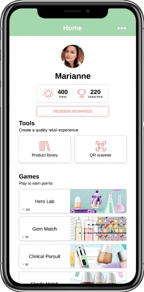
Creating a dedicated rewards redemption page
Users shared that they were unaware of the redemption process.
I figured, how can we present all this information upfront to remove user hesitancy?
As part of this, I sought to reduce the leg work needed to hunt down any logistical info. Tracking info and changes to mailing address is laid out accessibly at the very top.
#3 — How might we remove frictions on the Clinique Hero experience?
Design Solution #3
I mapped out the current task flow for the sign up process. I realized that the current flow doesn’t align with logical mental models for a sign up process + felt unnecessarily lengthy. I sought to address this.

Designing a new happy path
Although Clinique Philippines doesn’t have its own UX arm, I requested to collaborate with Clinique IT for much needed back-end wisdom. Collaborating with IT, I was advised against eliminating any input field.
Knowing this, I set out to maintain all necessary input fields but think about how I can help the user not feel like they’re going through a million tedious steps.

As a result, my design solutions were able to reduce registration steps by nearly half!
Usability Testing
What did Clinique Staff and Consultants think?
Because of scheduling conflicts, I was only able to get feedback on my designs from 1 staff and 1 consultant. However, their feedback was valuable in providing me new perspectives on ways I can improve my work.
Positioning the Product Library and QR Scanner as retail-specific tools is limiting.
The Clinique staff member I spoke to identified that, staff can also use these tools in-office like for managing inventory or packing PR gifts. Moving forward, perhaps I can reiterate my design to broaden my UX writing so as not to limit the scope of the products.
Consider displaying Local Ranks.
Both employees shared that they are more interested in comparing rankings with colleagues they work directly with, so at a local level. Local ranks don’t exist in the current Clinique Hero experience, so perhaps I can find a way to integrate both Global and Local Ranks to better foster friendly competition. Or, maybe by adding filters to sort users by country?
Reflection
If I had more time, I would…
Expand on the rewards redemption process. I would love to map out that journey flow!
Include descriptions for each individual game
Find a way to display a user’s History of QR Scanned Products more visibly without cluttering the homepage